
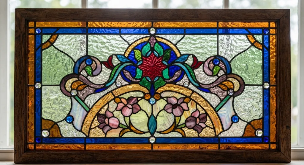
Textured and coloured glass combinations give leadlight designs their distinctive balance of pattern, privacy and changing light. The same panel can feel calm or dramatic depending on how its glass surfaces, hues and lead lines work together. Choosing materials is therefore more than a matter of appearance. Understanding these relationships helps create decorative glazing that feels intentional, whether it is used in a door, a window or a feature panel.
Glass Textures That Shape Leadlight Designs
Textured glass changes how light enters a space without relying on colour alone. Rippled, patterned or pebbled surfaces soften views and scatter daylight, making them useful where privacy matters but a room should not feel closed off.
Texture also adds visual depth to a panel. When paired with smooth glass, it creates contrast that can define borders, highlight a motif or give a geometric pattern more dimension. Leadlights can incorporate textured glass to combine decorative details with subtle variations in light transmission, creating distinctive window designs that enhance both privacy and visual appeal.
Texture Choices for Privacy and Light Diffusion
Different surfaces produce different effects: fine patterns blur details gently, while heavier textures obscure more of the view. The right choice depends on the panel’s position, the amount of natural light available and the degree of privacy required.
Using several textures in one design can make the composition more expressive, but restraint keeps the pattern legible. A limited selection allows each surface to contribute without competing for attention.
Once surface character is established, colour brings another layer of control to the panel’s atmosphere.
Colour Combinations for Leadlight Panels
Coloured glass can create a focal point, echo nearby materials or introduce subtle warmth. Its appearance shifts with daylight, orientation and surrounding finishes, so a hue that seems understated in one setting may become vivid when sunlight passes through it.
Successful colour harmony does not require a large palette. A few related tones can produce a quiet, cohesive effect, while carefully placed contrasts draw attention to a central motif or border. Clear and lightly tinted pieces can give stronger colours room to breathe.
Palette Planning for Balanced Glass Combinations
Before selecting individual pieces, consider how the panel relates to the room’s light and visual character. A practical palette may include:
- Clear or lightly tinted glass to preserve brightness and balance richer shades.
- Related colours to create a unified, gentle transition across the design.
- A contrasting accent to emphasise a focal detail without overwhelming the whole panel.
These choices are best assessed together, since glass seen individually may look different once assembled. A sample arrangement can reveal whether the colours complement one another under the light conditions of the intended location.
Colour and surface need to work as a team; the structure that joins each piece gives the final composition its definition.
Material Choices for Decorative Glazing
Lead came holds separate glass pieces in place and forms the visible lines that shape a leadlight design. Its width, colour and placement influence whether the panel feels delicate, traditional or strongly geometric.
Borders, roundels and jewel-like details can add emphasis, while obscure backing glass can provide additional privacy. These options should support the panel’s purpose rather than compete with its main pattern.
Design Planning for Durable, Cohesive Panels
Good planning connects appearance with practical needs. A window facing a busy exterior may benefit from more obscuring texture, whereas a shaded interior panel may need clearer areas to make the most of available light.
The following overview shows how common choices affect the finished result:
| Material or Feature | Visual Effect | Design Consideration |
|---|---|---|
| Textured glass | Softens views and scatters light | Select texture according to privacy and brightness needs |
| Coloured glass | Adds mood, emphasis and pattern | Check hues together in the panel’s intended light |
| Lead came | Defines outlines and joins glass pieces | Coordinate line weight with pattern scale |
| Roundels and borders | Frame or accent the composition | Use details to reinforce, not distract from, the design |
When glass, structure and setting are considered as one composition, decorative glazing can combine privacy, daylight and character with lasting coherence. A leadlight specialist can help assess materials and develop a design suited to the space.