
We have all heard of the so-called color rules for interior design, such as, not to use beige otherwise, the room can look very dull. However, today, we are here to help you get rid of your misconceptions about interior design colors.
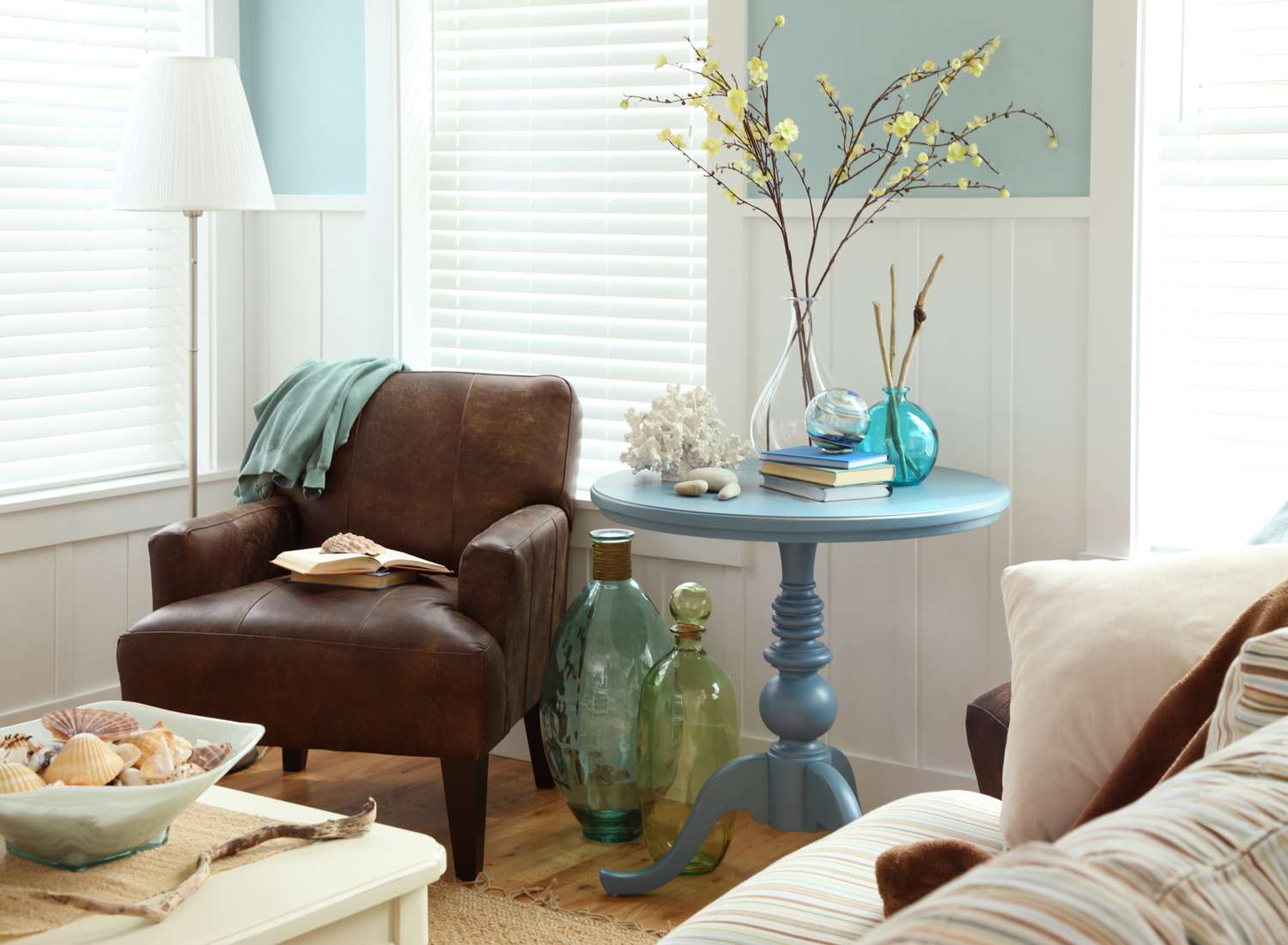
#1. The Only Function of Blue Is Calming

This isn’t true at all as blue doesn’t have only one shade. As per Liz Williams, an acclaimed home designer, “There are shocking blues out there that are not very calming.”
Let give provide you with some examples:
- To make a space feel more energetic, sky blue can be chosen.
- Turquoise and ocean blue are selected for more relaxed settings, such as for a bedroom.
- Silver blue tend to give a more elegant and contemporary style.
- Midnight blue and other similar deep tones are bolder and can convey more powerful messages.
#2. Pastel Colors Are Feminine
As per color psychology, all colors have a specific connotation and are associated with a specific emotion. And since the beginning of time, lighter and softer colors have always been seen as exclusive female colors, while darker nuances are used to create a more masculine ambiance.
However, just because someone once said that pastel colors are feminine, it doesn’t mean that you can’t use pastel colors with darker tones to create a fantastic space. Besides, you can also choose a pastel color that you love for your main pieces of furniture and balance them out with darker colors so as both genders are integrated and look breathtaking together.
#3. Every Room Should Be a Different Color to Show Individuality

Suppose you walk through a house where every room displays a new color. Well, by the time you have walked through the entire house, believe me, you would feel as if you have gone to the circus.
Individuality in rooms is a good idea, but that doesn’t mean you have to go as dramatic as showcasing an entirely different color for each room. Instead, it is recommended to choose a coordinating palette of colors for your entire house which will make all the rooms flow together visually.
#4. Monochromatic Colors Cannot Feel Warm and Welcoming
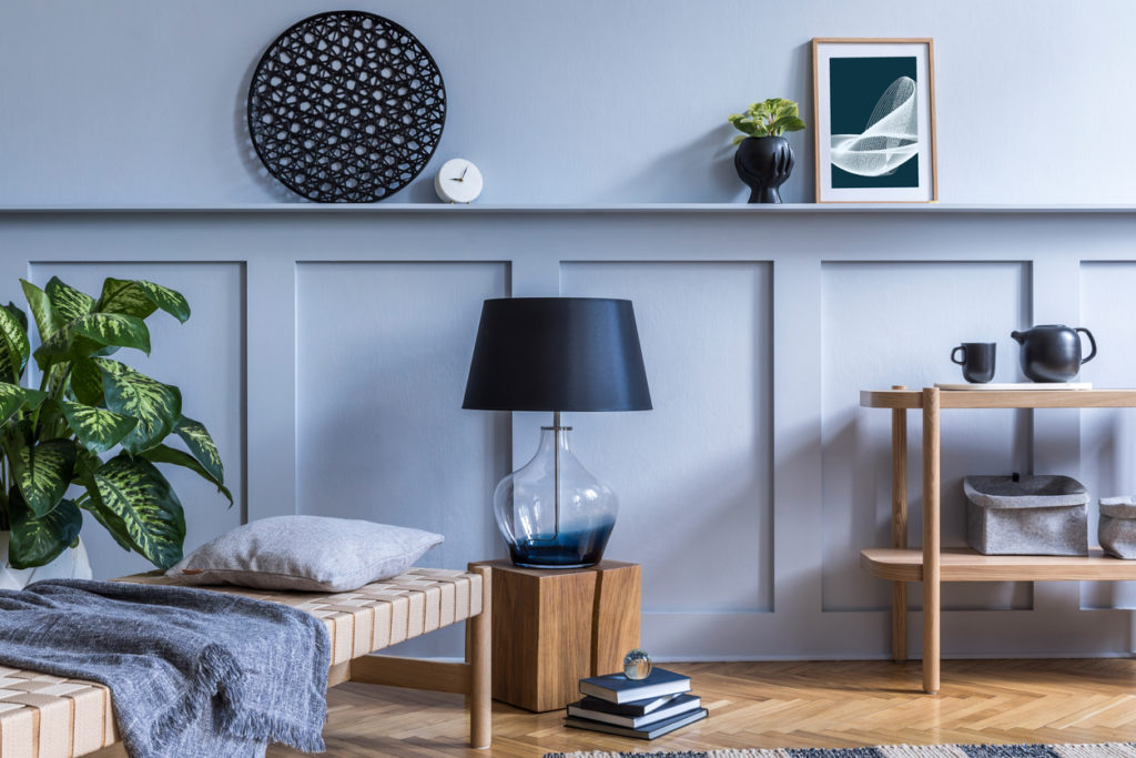
Sometimes, when black and white are combined together, they can create a high contrast interior which can be very uncomfortable. So, if you really want to use monochromatic colors, make sure to use them with subtle patterns. In addition, do not create a room with dark walls with dark furniture and only a few hints of white.
#5. Neutral Color Palettes Are For the Unadventurous

Many homeowners are often under the false impression that neutral colors are lifeless, boring and unadventurous. On the contrary, it is quite the opposite.
In reality, neutrals don’t have to come from only the beige and tan color family. For example, neutral colors such as warm gold, camel brown, buttery cream and greige are anything but boring.
Let me give you a tip: these colors can be combined with black or chocolate brown and I assure you the end result will be an incredible array of tones.
#6. Children’s Bedroom Should Only Consist Of Primary Kids’ Color Schemes

Many parents often tend to choose only the primary colors like red, yellow and blue for their kids’ bedrooms. However, when it comes to choosing colors for these spaces, let me tell you that the sky is the limit.
What you can do is to use a color palette of complimenting saturations of your kids’ favorite colors to liven up their rooms.
#7. Choosing Colors by Daylight Is More Important Than Evening

Isn’t it true that most of us test out colors in the day? Sometimes, depending on the room’s layout, daylight and also artificial lighting can play a significant role in how the colors appear to you during different times of the day. Therefore, it is a good idea to paint small samples on a wall and observe how the color looks at different times of the day.
So, what do you think about these myths? Please share your comments!